#MobileApp
#Figma
#designsystem

1
Challenge in Travel Industry
Many travelers face the common challenge of staying within budget during trips, leading to potential financial stress and compromises on the overall travel experience. Group trips, in particular, introduce the added complexity of accommodating diverse food preferences, making it challenging to find dining options that satisfy everyone’s tastes.
2
Gap in Personlization
The current travel landscape lacks personalized insights into optimal seasons for specific destinations, leaving users unaware of the best times to visit. This gap also extends to a deficiency in detailed information about activities at travel destinations, hindering users’ ability to plan diverse and enjoyable experiences. The absence of a personalized itinerary feature further compounds these issues, offering generic travel plans that don’t consider individual preferences and unique travel styles.


1
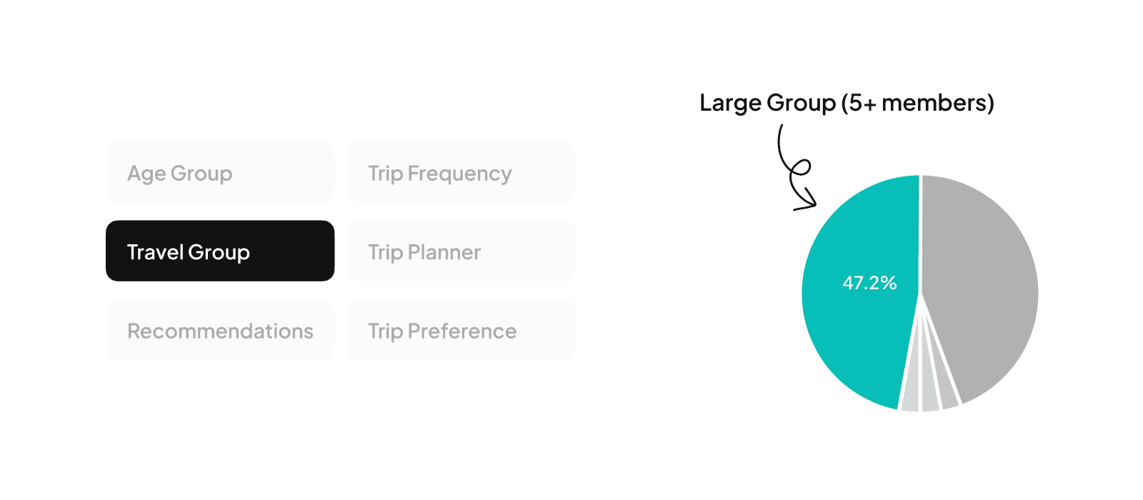
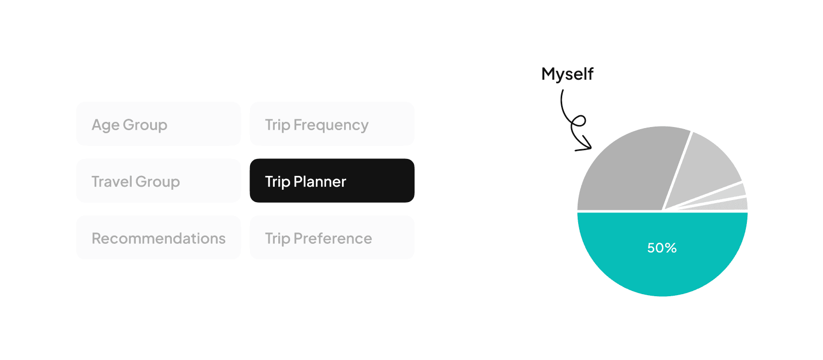
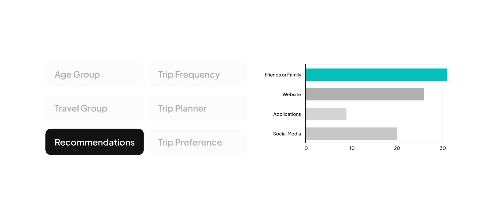
User Surveys
We decided to conduct a survey to gather insights about the user’s behaviour and preferences when planning a trip. We created a Google form consisting of open ended, close ended and rating questions for this purpose and distributed it online, gathering insights from the users responses.


2
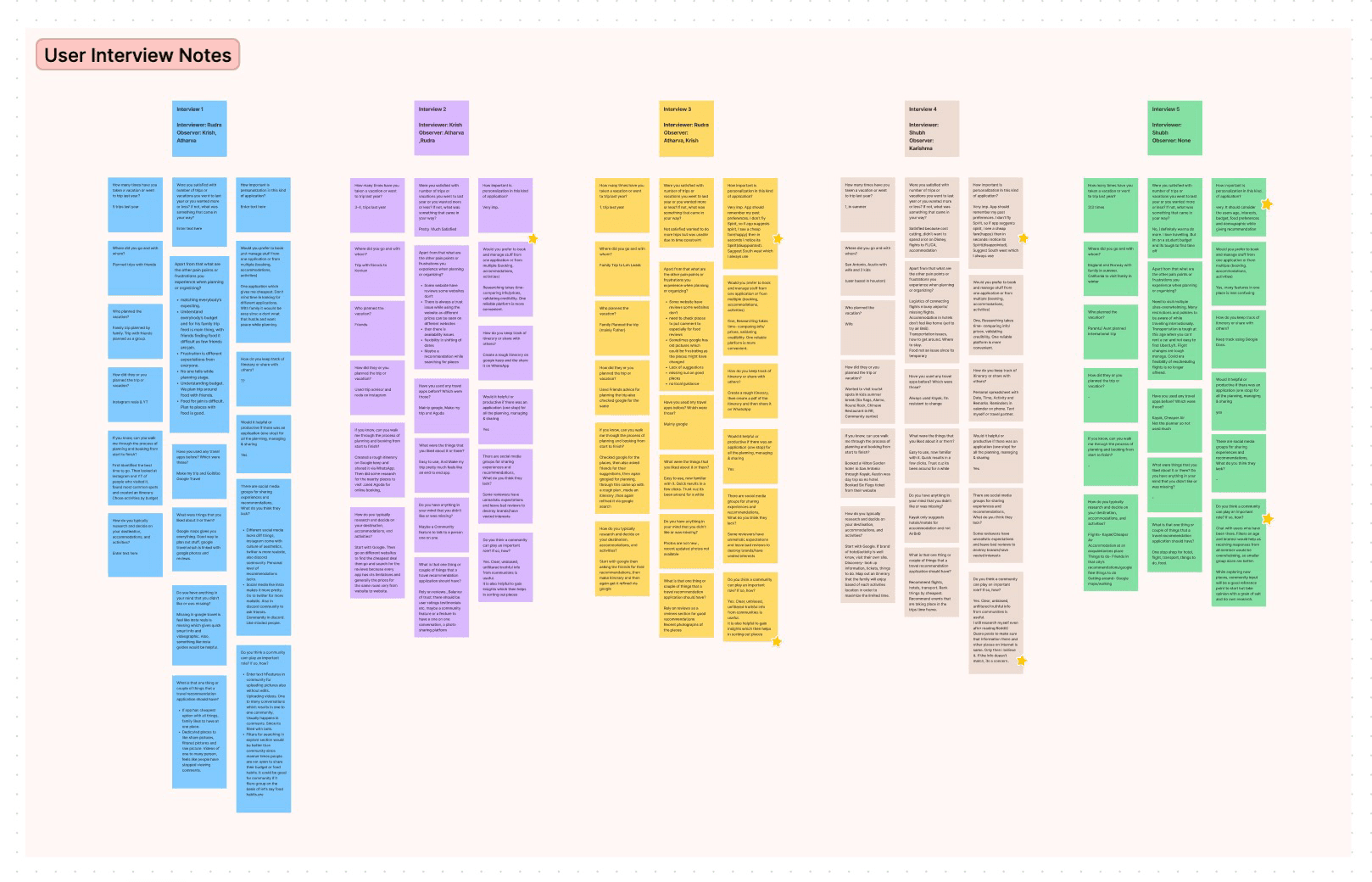
User Interviews
While the user survey gave us a vague idea, in order to paint the full picture, it was important to know the user’s reasonings and suggestions. For detailed insight, we carried out user interviews with 5 respondents. We conducted interviews both online via zoom and in person, where one of us acted as a moderator and another team member acted as an observer/notetaker.
USERS PAIN POINTS
To identify competitors for PlanEase, we conducted market research in the travel planning app market by carrying out online searches, reading travel blogs and magazines, and asking respondents in user interviews about their preferred apps or websites. Based on popularity, we narrowed down direct competitors to Expedia, Hopper and RoadTripper and included Google as an indirect competitor. We then analysed the identified competitors based on their features, pricing, user reviews, and marketing strategies.
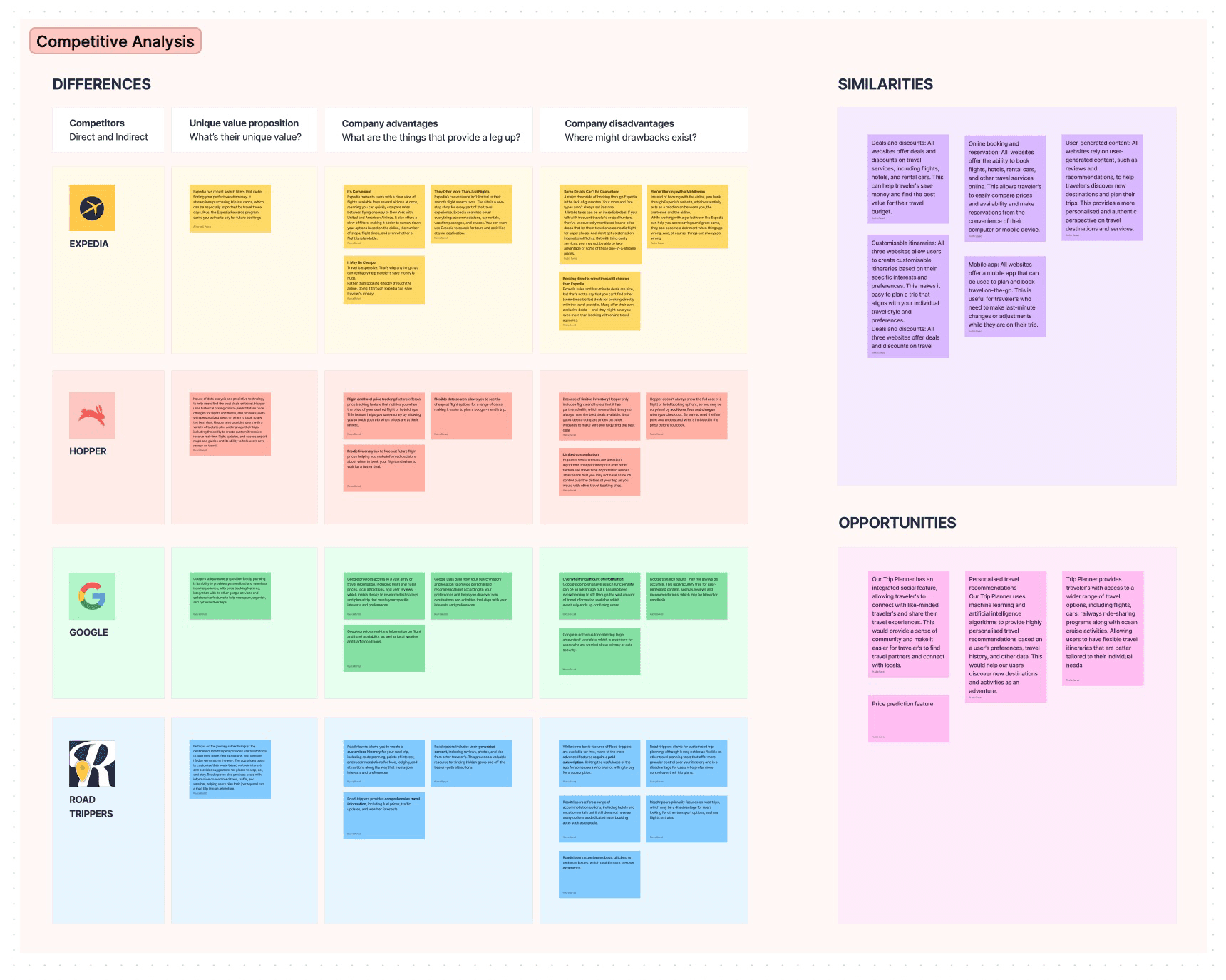
Based on our research findings, we narrowed down features we’d like to include in PlanEase and created an initial blueprint of the platform.

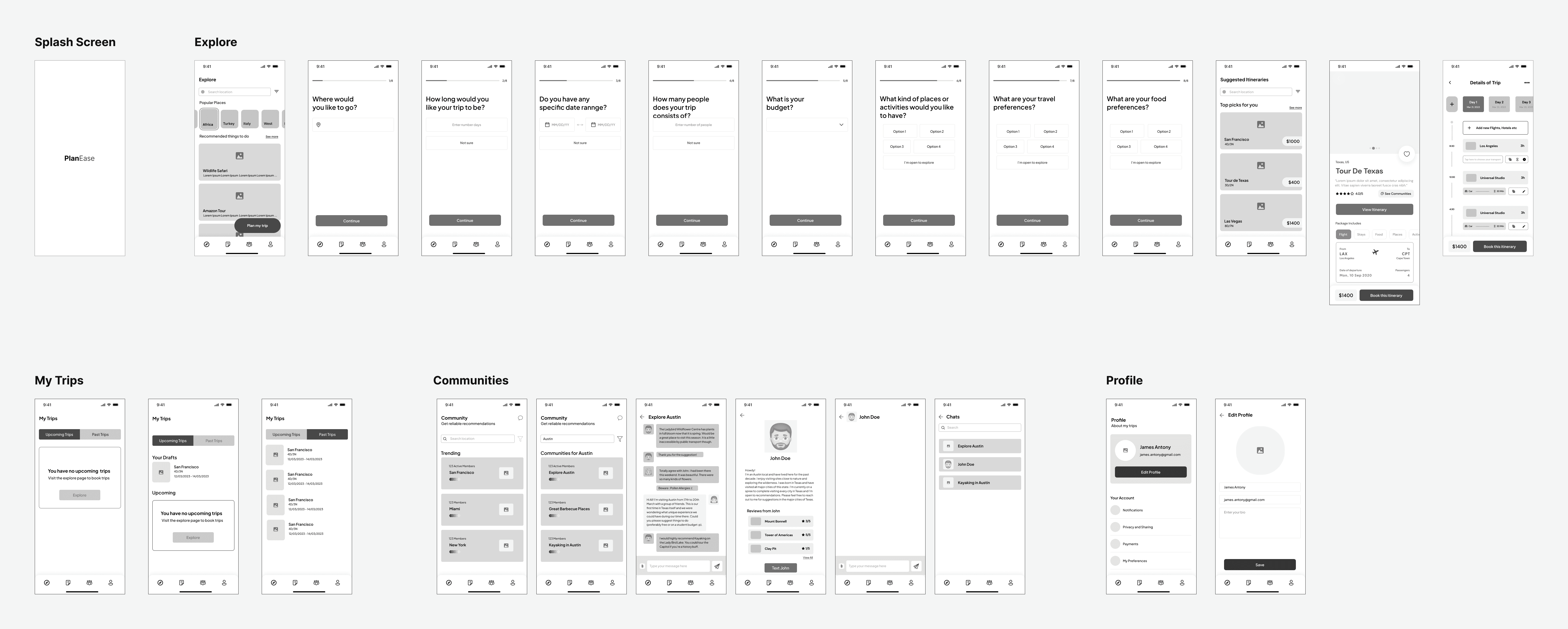
In the initial phase of PlanEase development, we translated our comprehensive blueprint into tangible wireframes. Collaborating through whiteboard sessions, we melded insights from user research, surveys, and interviews to ensure an intuitive user flow that addressed identified pain points. Leveraging Figma, we crafted lo-fi wireframes, solidifying the foundation of the app’s features.
Whiteboard Wireframes

Low Fidelity Wireframes

Building on our low-fidelity screens, we started creating mid-fidelity screens individually. To make mid-fi screens, we used the same neutral color palette and components that we used in our low-fi wireframes. We connected virtually on zoom and provided our views and critiques on each other’s designs. The constructive criticism and regular check-in helped us ensure our designs would provide a good user experience.
Medium Fidelity Wireframes
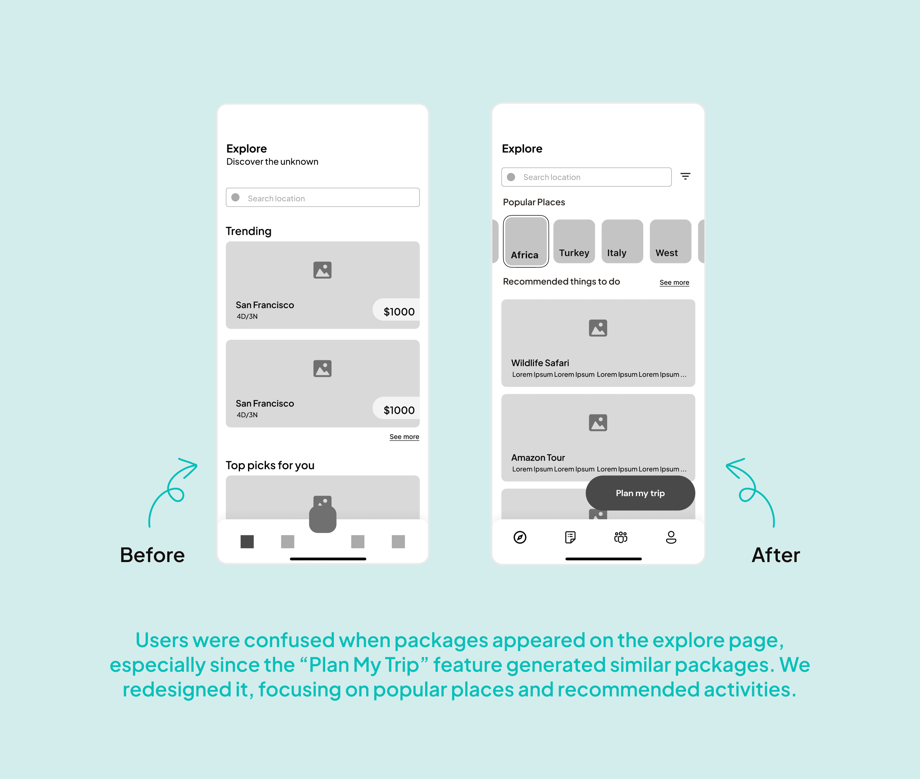
Using the wireframes we made initially, we tested a couple of users to know if we were going in the right direction or if we needed to make changes to functions that might not be intuitive or might confuse our users.


The visual design of PlanEase plays a pivotal role in evoking the spirit of travel and fostering an emotional connection with our users. Our team crafted a captivating visual language that embodies wanderlust, using vibrant colors, enticing imagery, and intuitive iconography. This cohesive design system amplifies our brand identity, establishing PlanEase as a trusted and inspiring companion for travelers worldwide.
Mood Board
To decide the aesthetics of the application and to bring life to our mid-fi prototype, we started marking the mood board which would help us to hone our individual ideas on the aesthetics of the application.

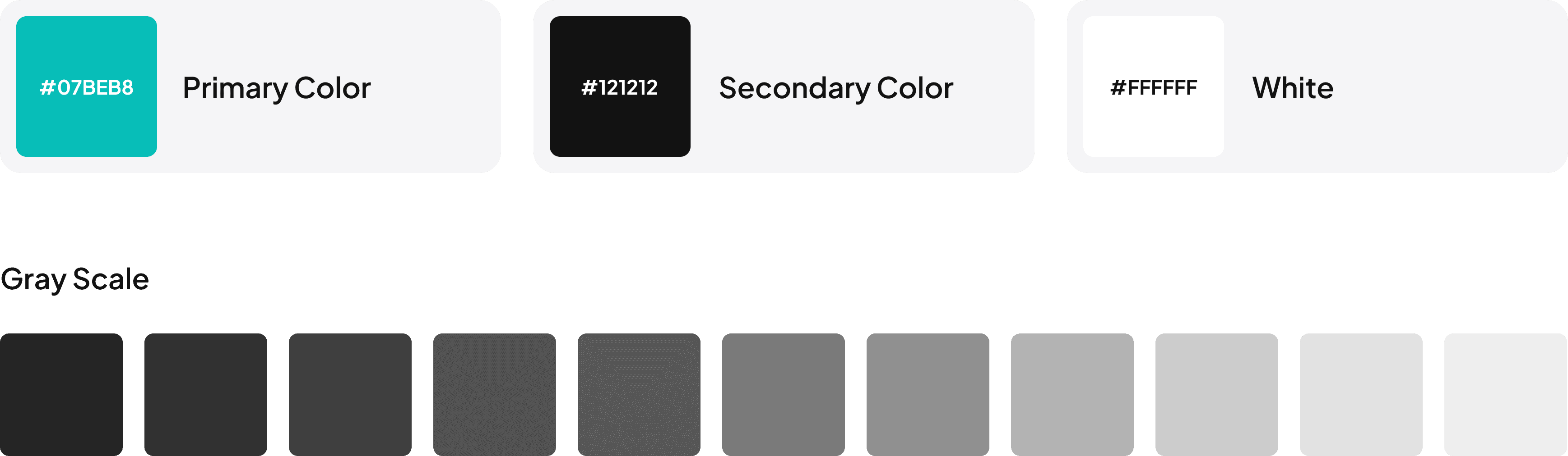
Color Scheme
Based on the mood board, we collectively decided to go with a color that induces a feeling of freedom and travel and is also just refreshing. Hence, we went ahead with turquoise. It is a relaxing and inspiring color that evokes images of crystal waters and is usually associated with liveliness, tranquility, youth, and energy. It is made of green and blue and can invoke a cheerful feeling of relaxation among the users.
Typography
Based on the mood board, we collectively decided to go with a color that induces a feeling of freedom and travel and is also just refreshing. Hence, we went ahead with turquoise. It is a relaxing and inspiring color that evokes images of crystal waters and is usually associated with liveliness, tranquility, youth, and energy. It is made of green and blue and can invoke a cheerful feeling of relaxation among the users.

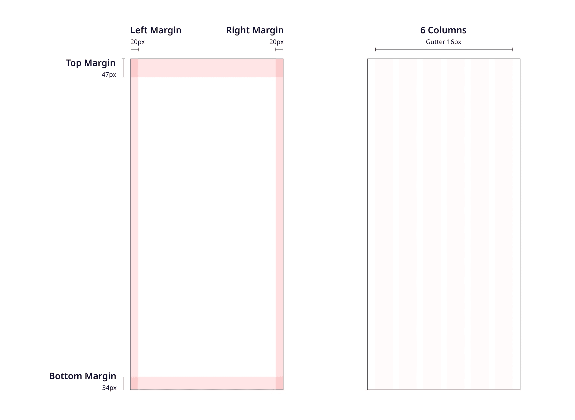
Layout and Spacing
Iconography

Components and Components Sets

High-Fidelity Designs
Progressing from mid-fidelity screens, we advanced the design to high-fidelity by implementing a cohesive design system. This involved crafting a color palette, defining iconography, and creating components, resulting in visually appealing screens that prioritize user-friendliness.
🔗 View Design in Figma

Usability Testing
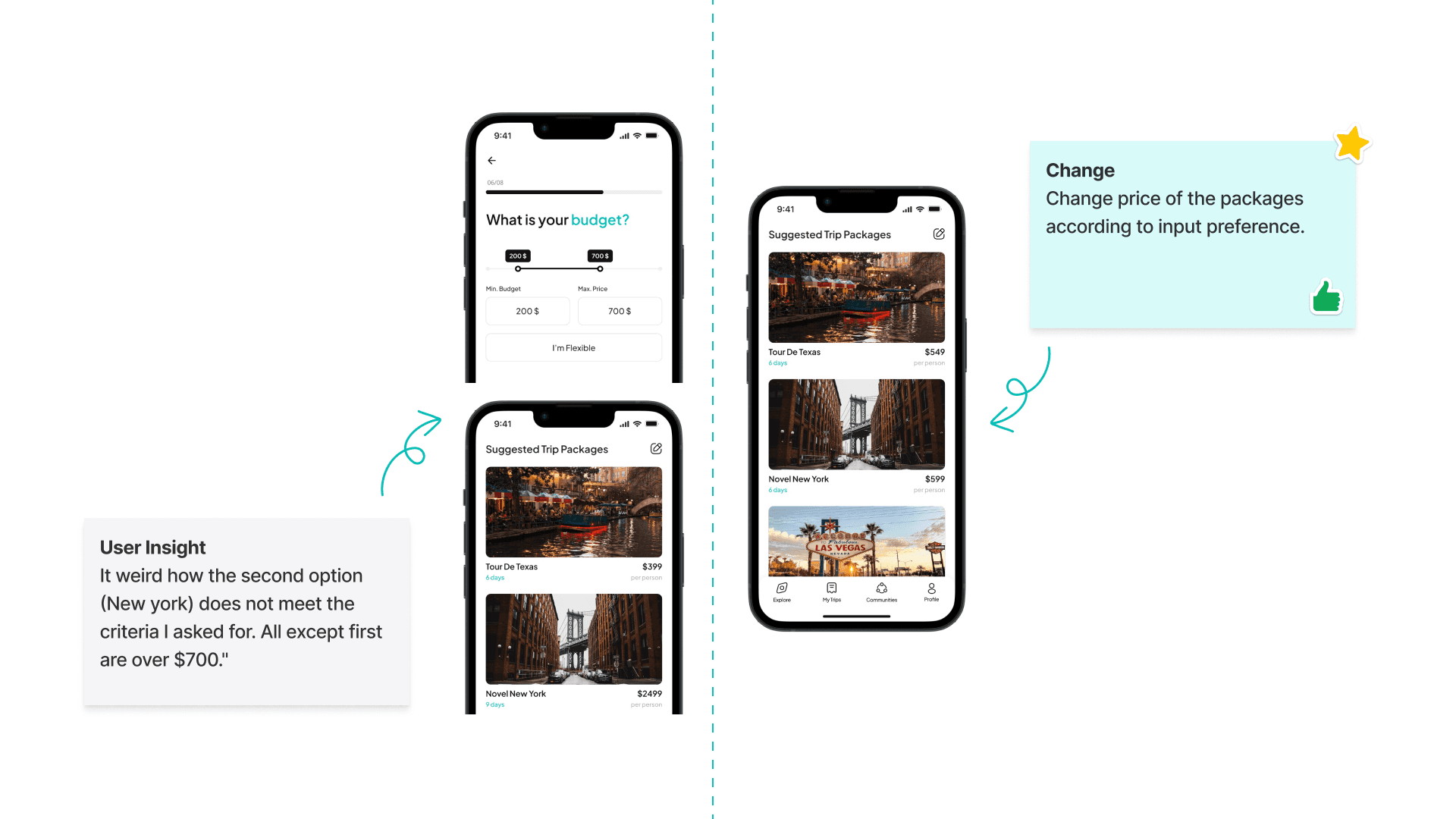
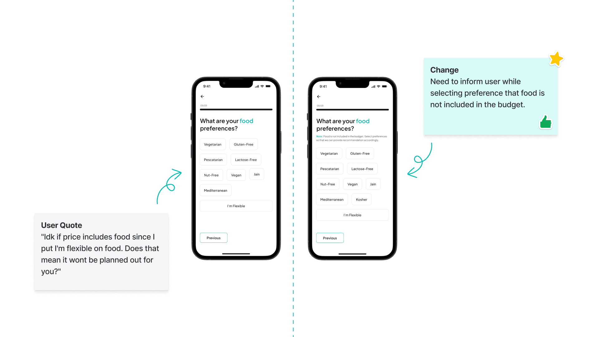
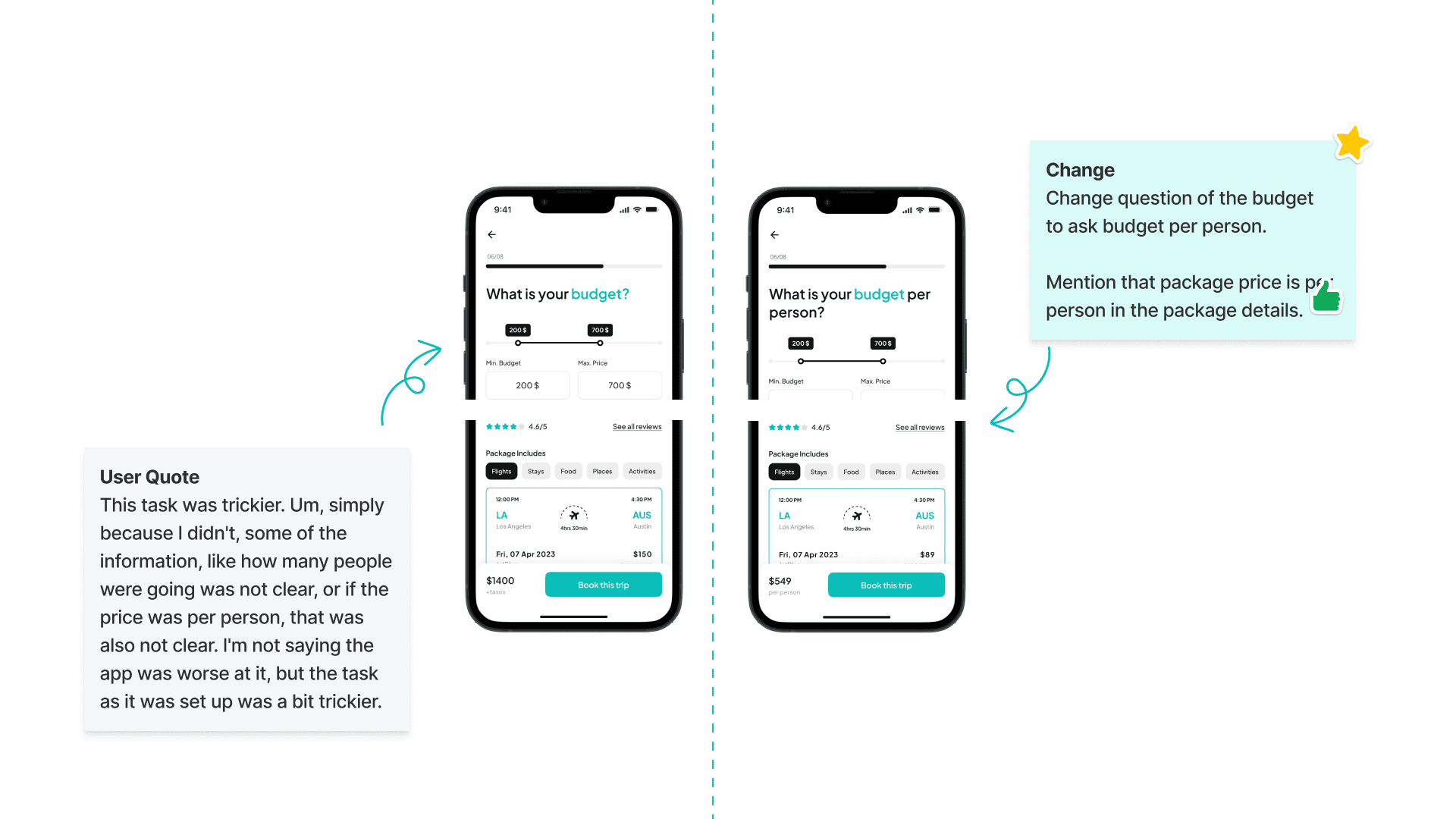
Leveraging high-fidelity design screens, we executed a comprehensive usability testing phase encompassing 18 tests over three rounds. The initial two rounds consisted of unmoderated tests on usertesting.com, with 9 tests in the first round and 6 tests in the second. The final round involved 3 moderated tests. Our diverse participant pool, spanning various age groups and genders, engaged in specific tasks within the app. Valuable feedback from these tests significantly contributed to refining the user experience by addressing identified issues. The System Usability Scale (SUS) score culminated at an impressive 88.7, affirming the positive reception of PlanEase.
🔗 View Full Analysis
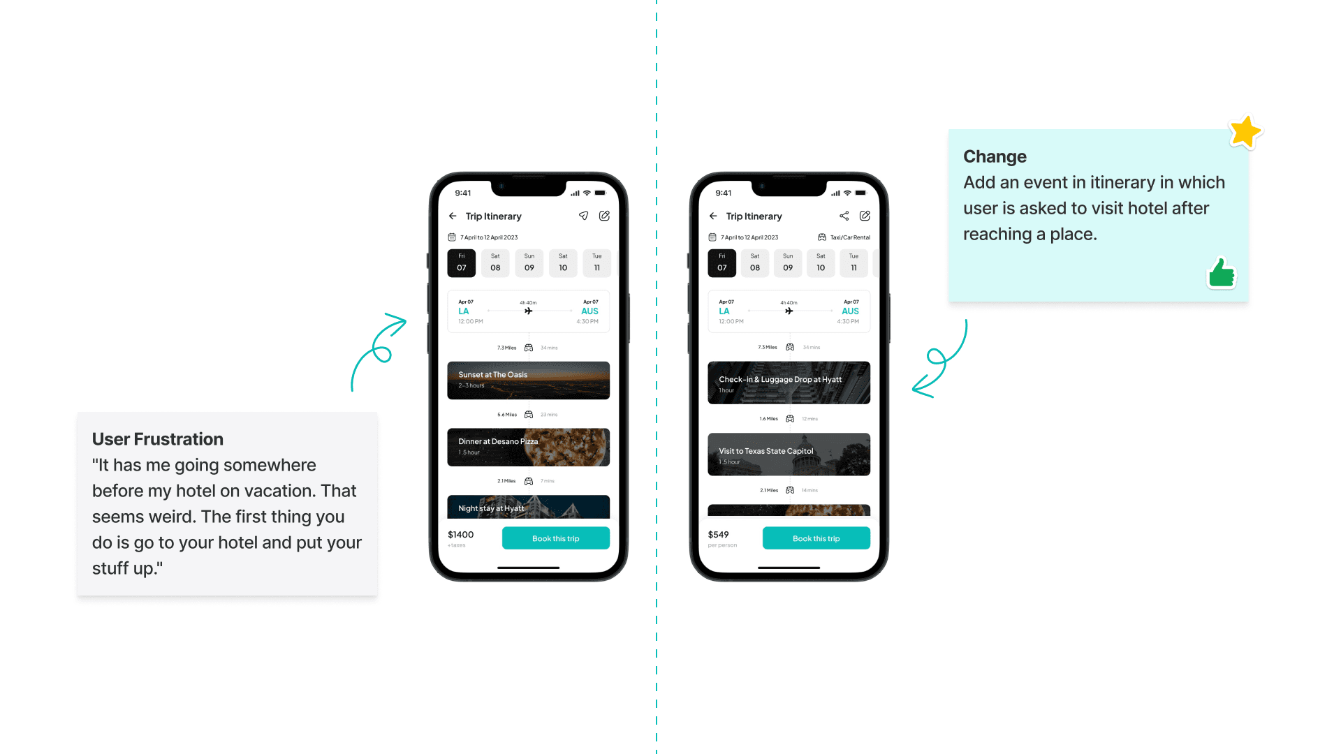
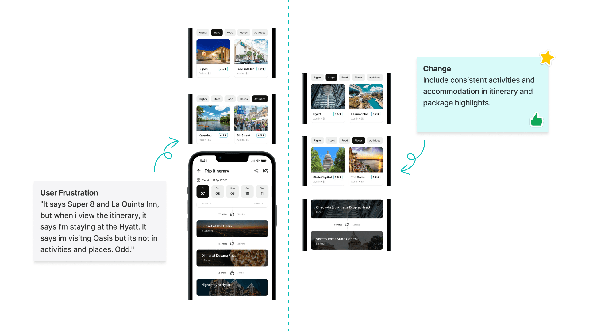
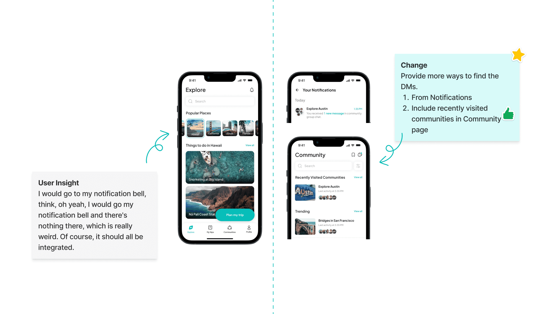
Users feedback and changes implemented


Final Hi-Fi Designs
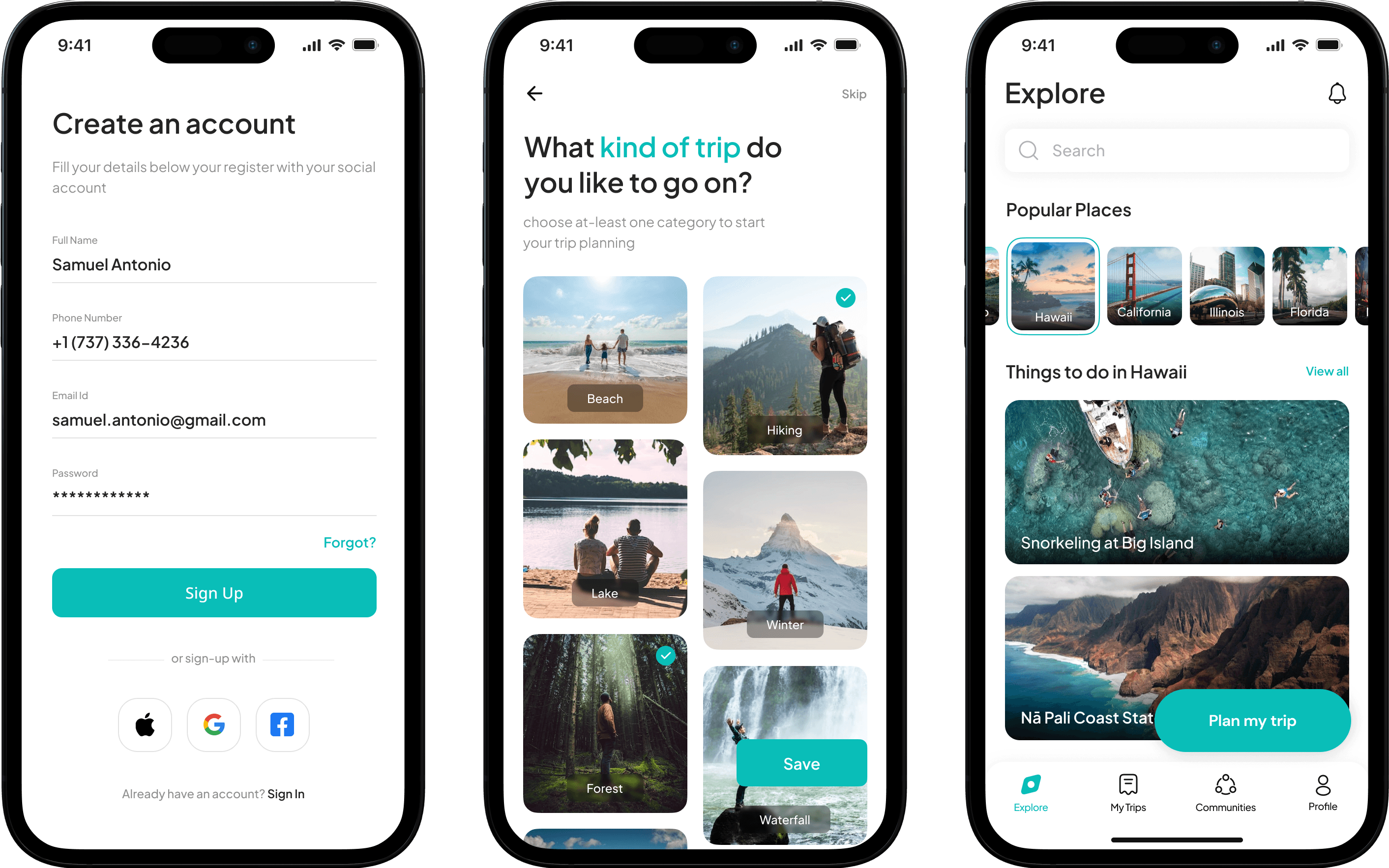
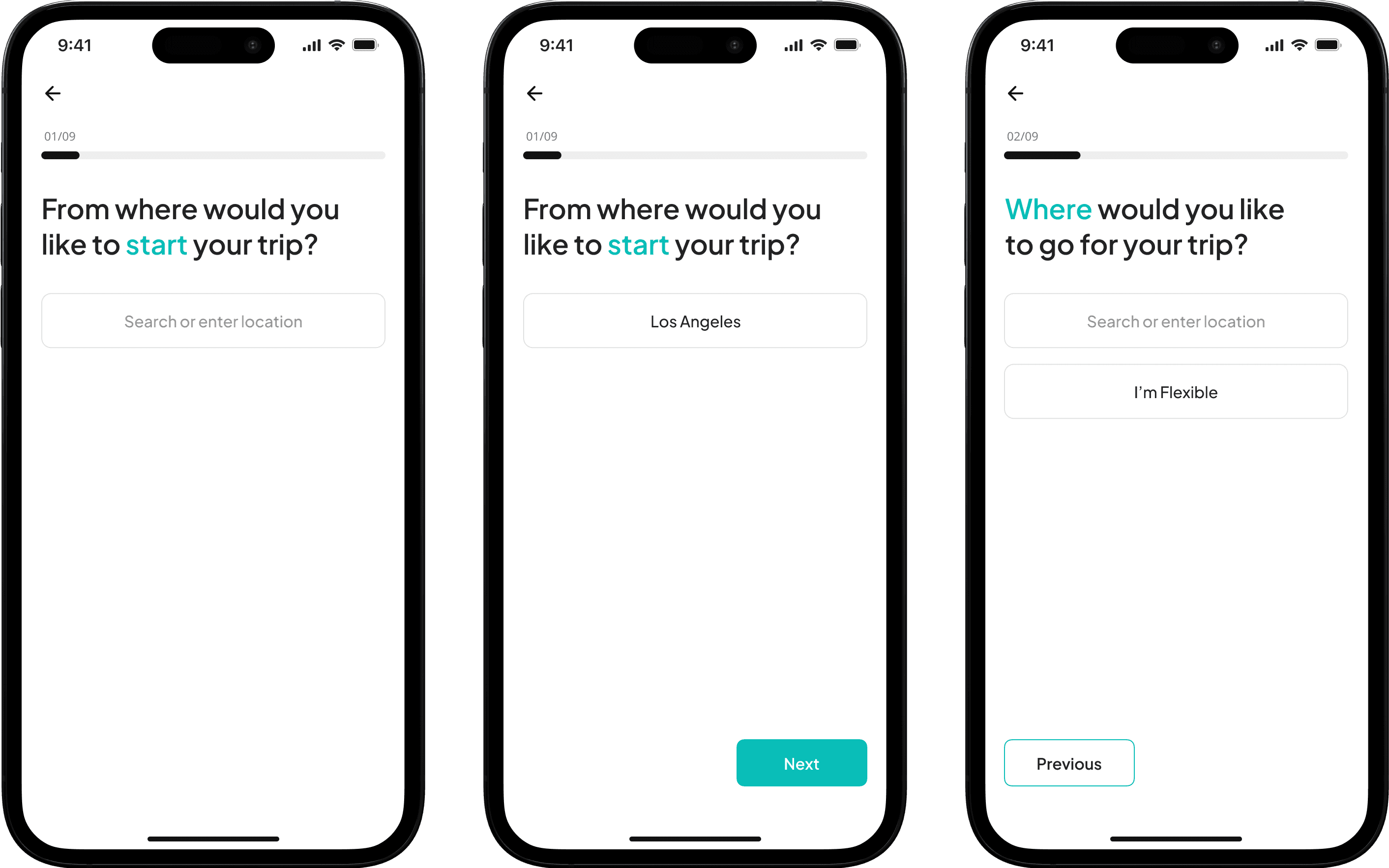
On-boarding Screens


Plan a Trip Screens

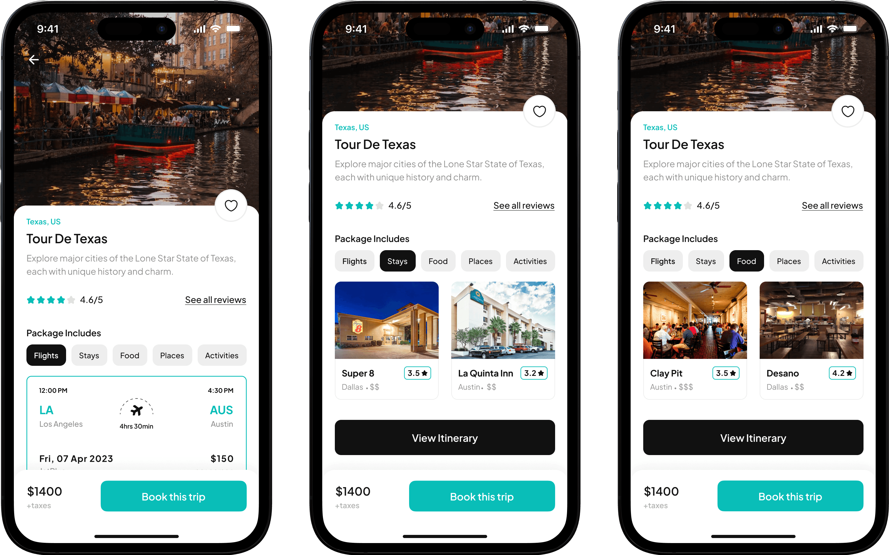
Package Details Screens

Reviews Screens

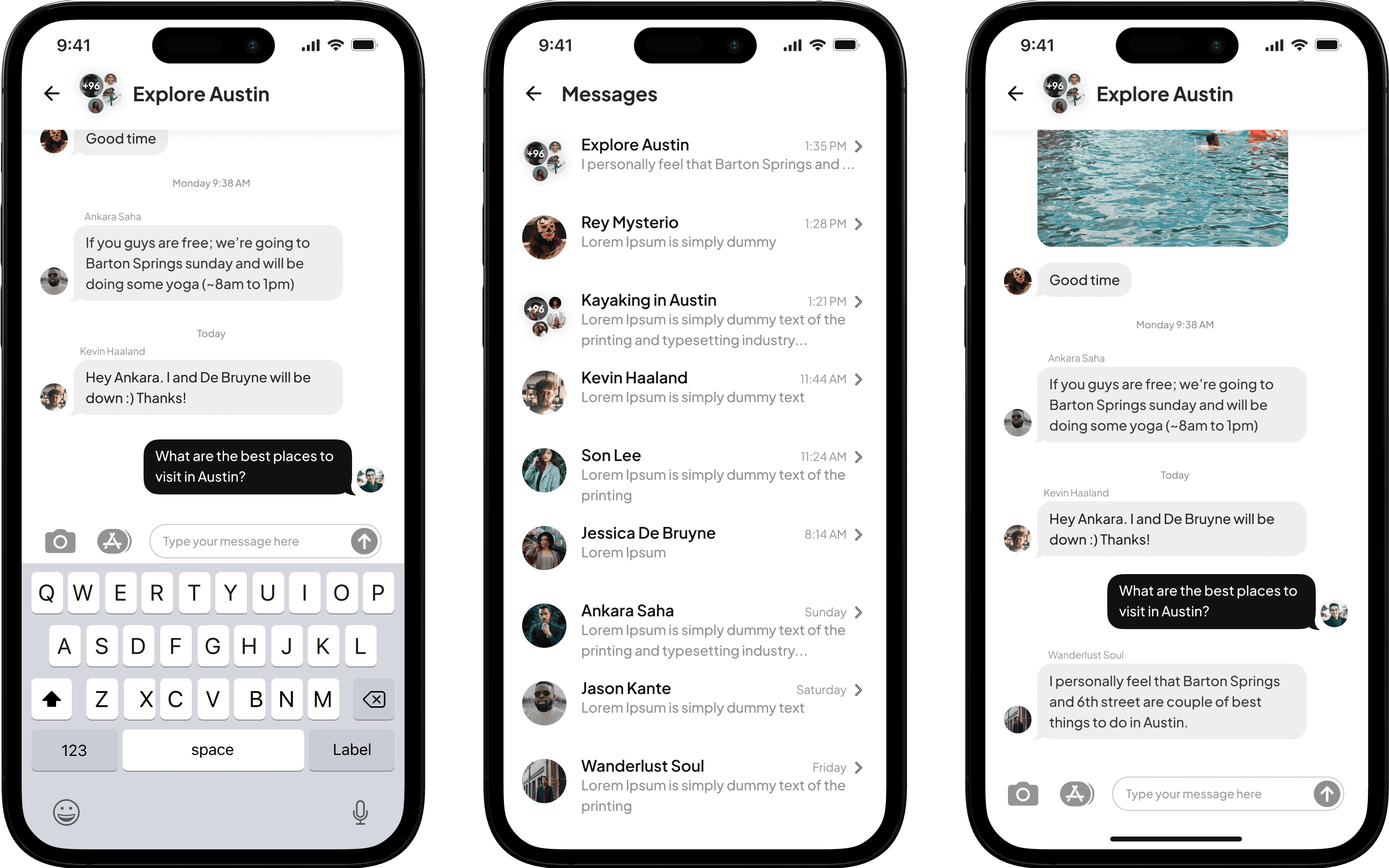
Community Screens


My Trips Screens

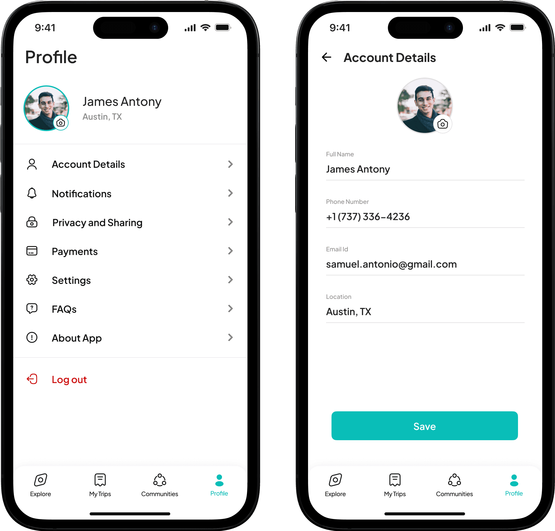
Profile Screens
Conclusion
In conclusion, PlanEase represents the culmination of a remarkable design journey aimed at transforming the way travelers plan and experience their adventures. With a user-centric approach, personalization features, and captivating visual design, we have positioned ourselves at the forefront of the travel industry. The potential for PlanEase to elevate our brand, increase customer loyalty, and capture new markets is undeniable. I am confident that our exceptional user experience, underpinned by meticulous research and a relentless pursuit of excellence, will enable us to create a lasting impact in the travel landscape and position our company as a leader in the digital travel industry.

