1
Evaluate the user experience for language learning within Duolingo’s mobile application.
2
Assess the accessibility and ease of use of the app’s features.
3
Identify design opportunities through an in-depth analysis of user interactions.
4
Provide actionable recommendations to enhance the overall usability of the Duolingo app.
We applied Jakob Nielsen’s 10 heuristics for interaction design to evaluate the app’s interface and interaction design. We rated each heuristic violation on a severity scale of 0 to 4, where 0 = no usability problem and 4 = usability catastrophe.
🔗 Click here to see complete Heuristic Evaluation.

Heuristic 03: User Control & Freedom
Severity - 3
Actual Issue:
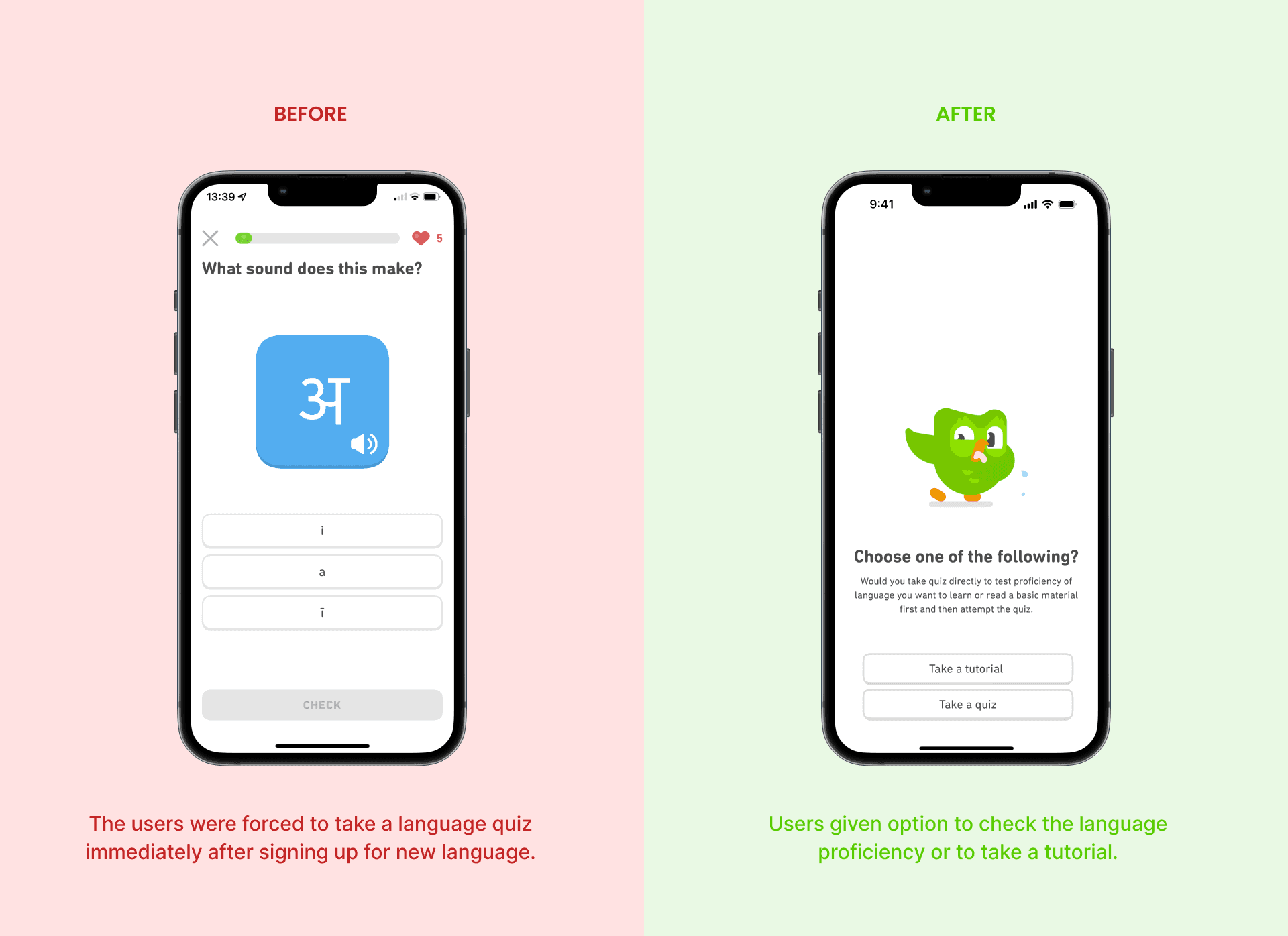
The user is forced to take a language quiz immediately after signing up. They face unfamiliar characters and lose 1 out of 5 lives for each incorrect answer. Each life takes up to 5 hours to refill.
Impact:
This might result in the user panicking to get the answer right and feeling disoriented or unmotivated to continue learning the language.
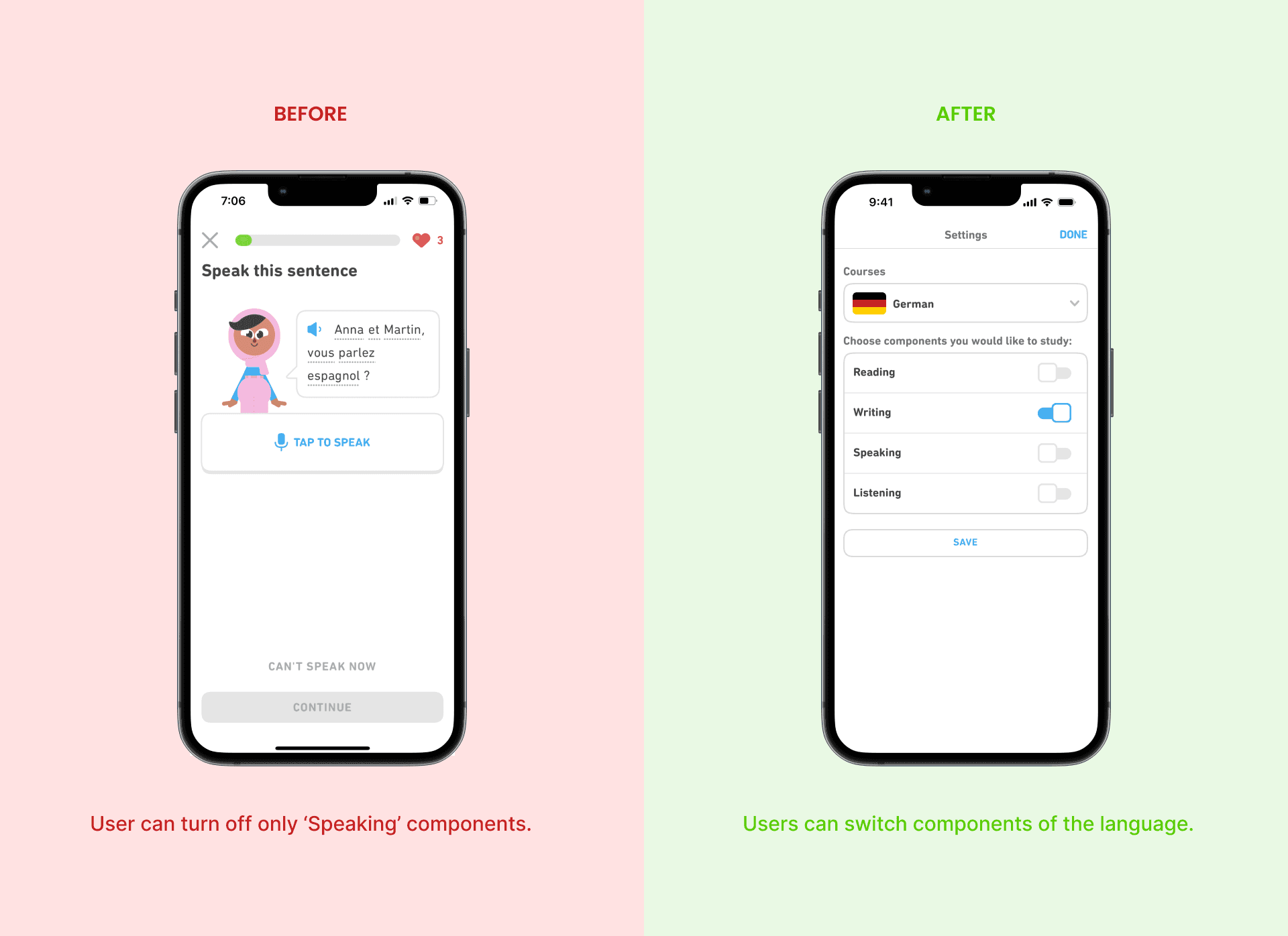
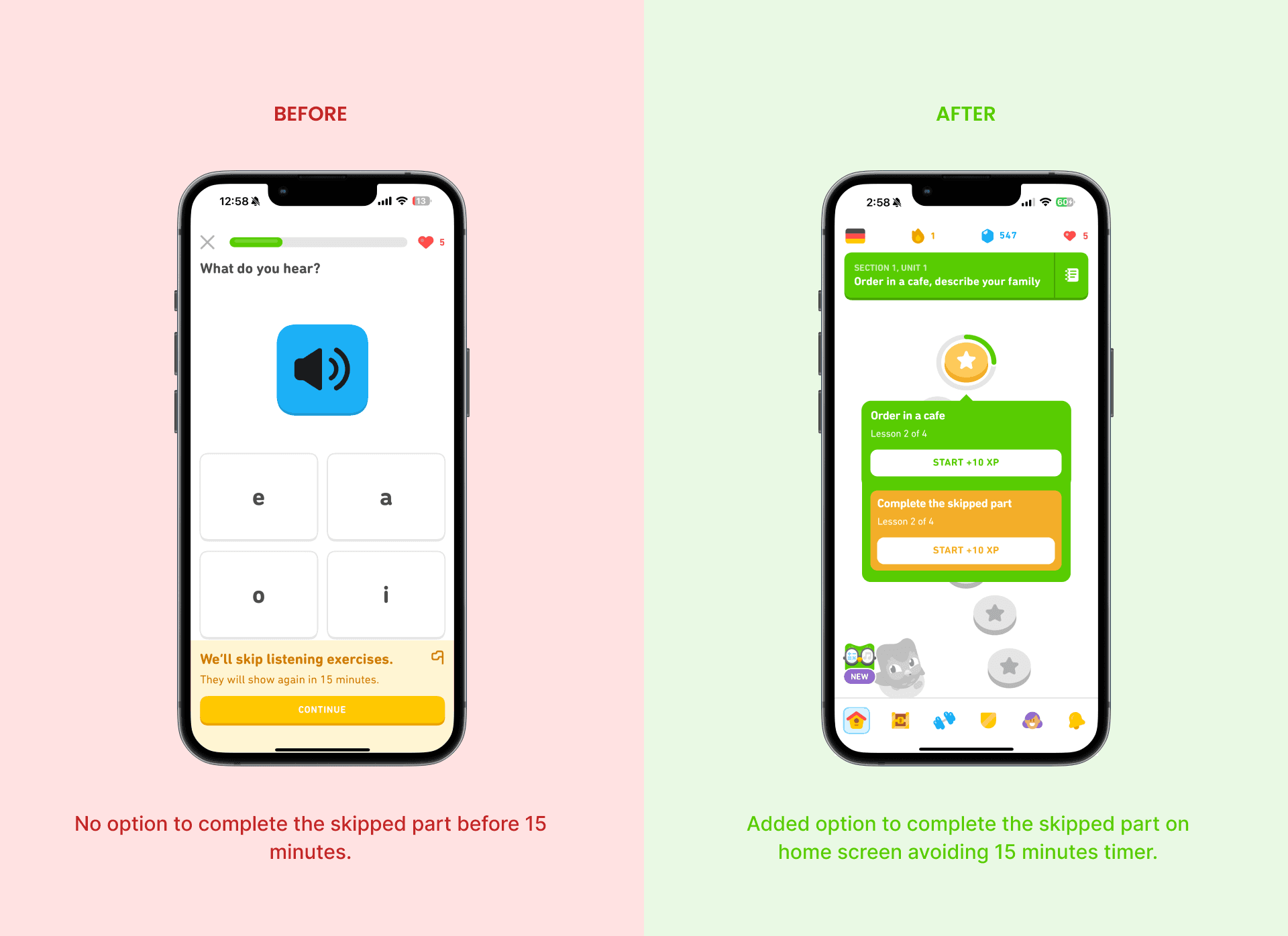
Severity - 3
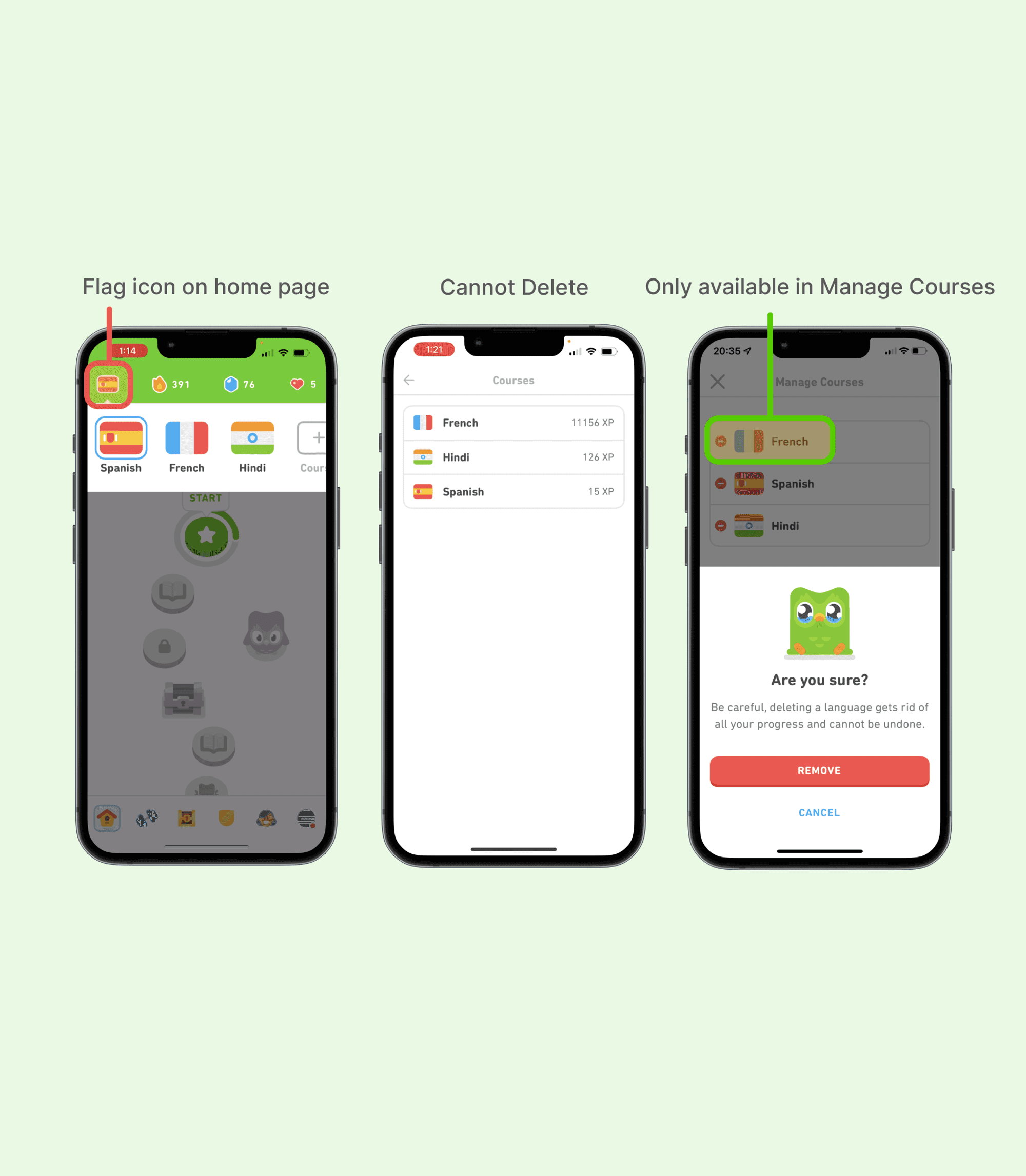
Actual Issue:
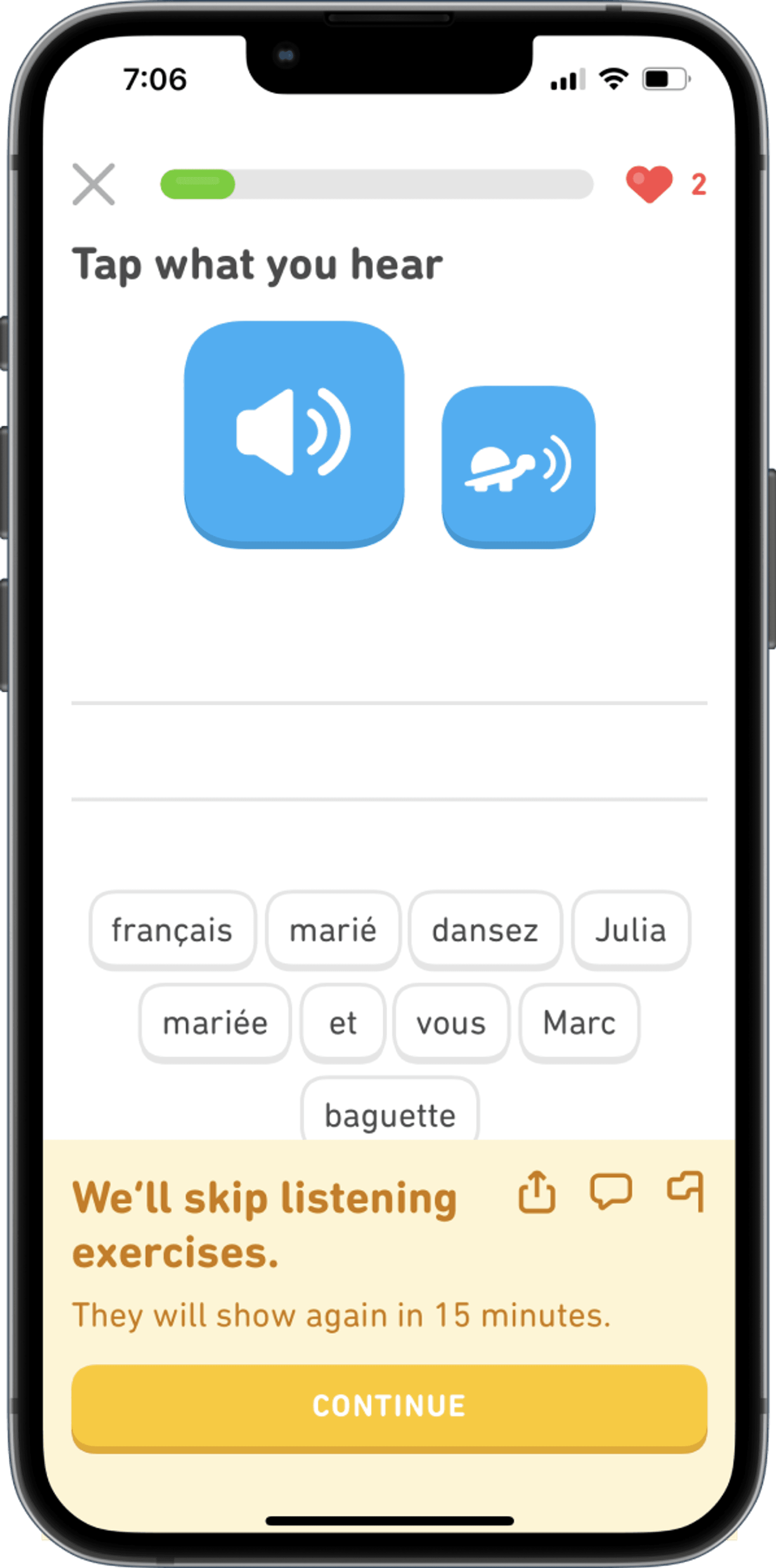
Users can skip specific learning components (for example, speaking) for 15 min without further operation and complete multiple units without having to retake the skipped parts.This leads to an imbalance in learning the language holistically.
Impact:
The users might miss out on learning some components because they do not have an option to revisit the skipped lessons. Learning could be imbalanced in case the course is prescribed as a lesson in school.
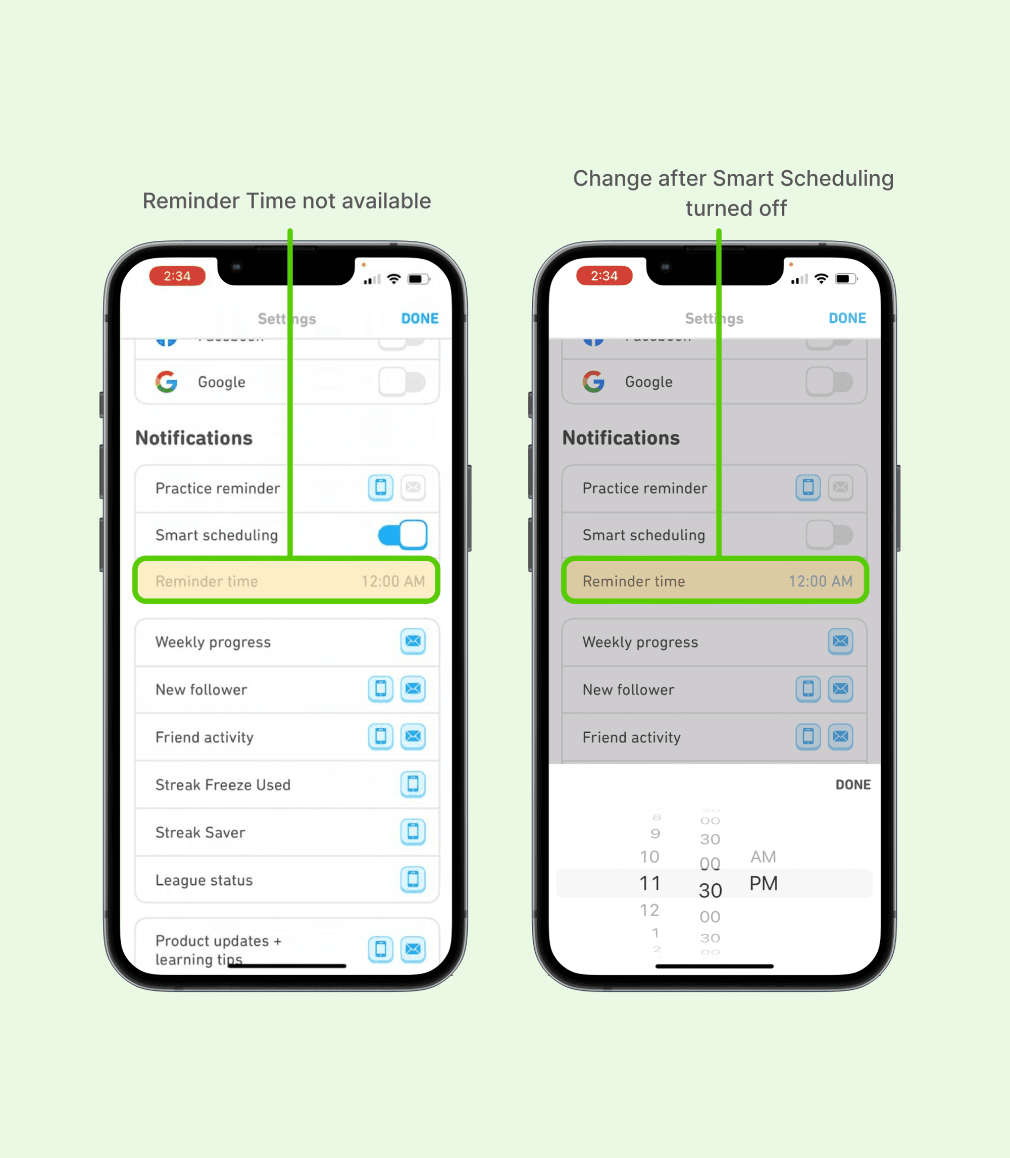
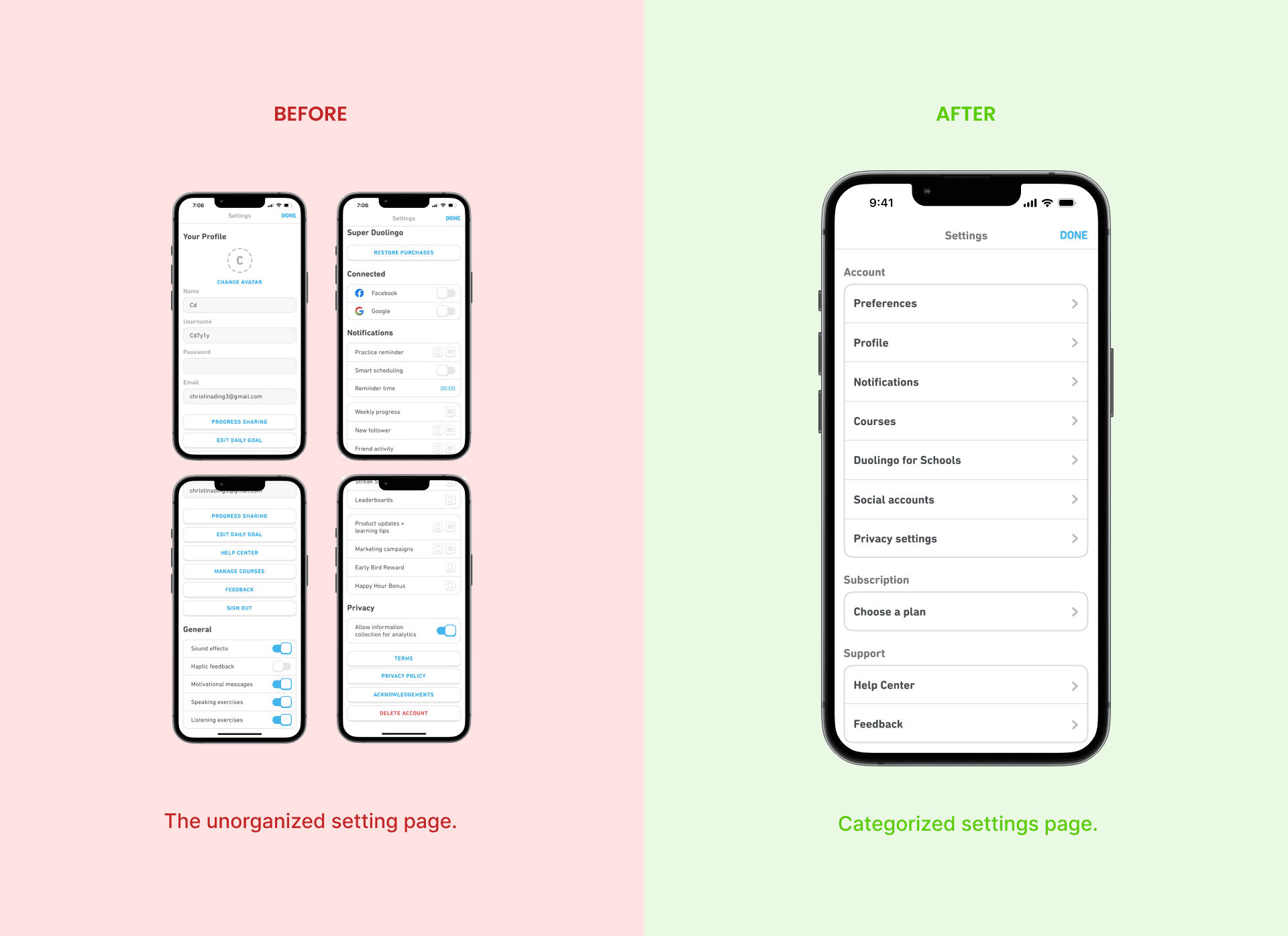
Heuristic 08: Aesthetic & Minimalist Design
Severity - 4
Actual Issue:
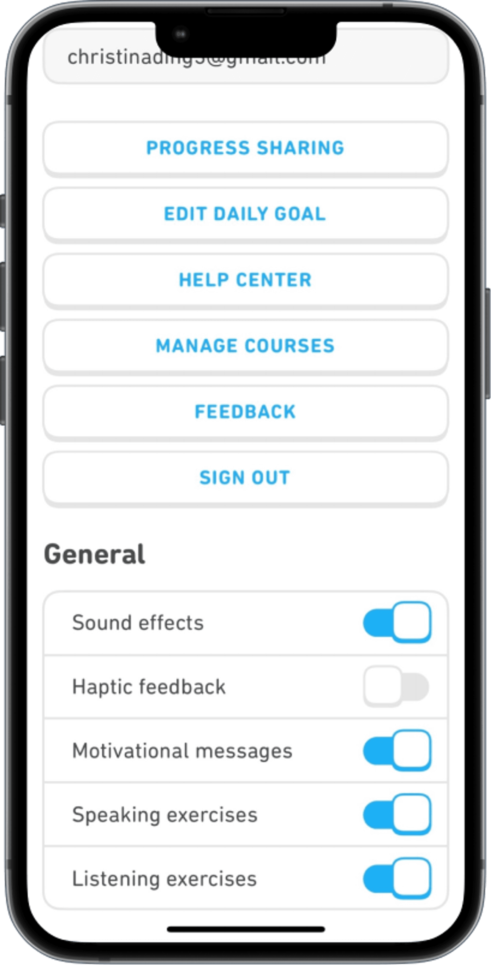
The unorganized setting page makes it hard for users to locate any function. It consists of profile info, uncategorized buttons, unfoldable sections containing buttons, toggle switches, and a time picker. The outcome is a long page for the user to scroll through rather than a well-defined classification that can help a user narrow down choices.
Impact:
For both inexperienced and experienced user, it takes more time and effort to set anything or find help in the page.
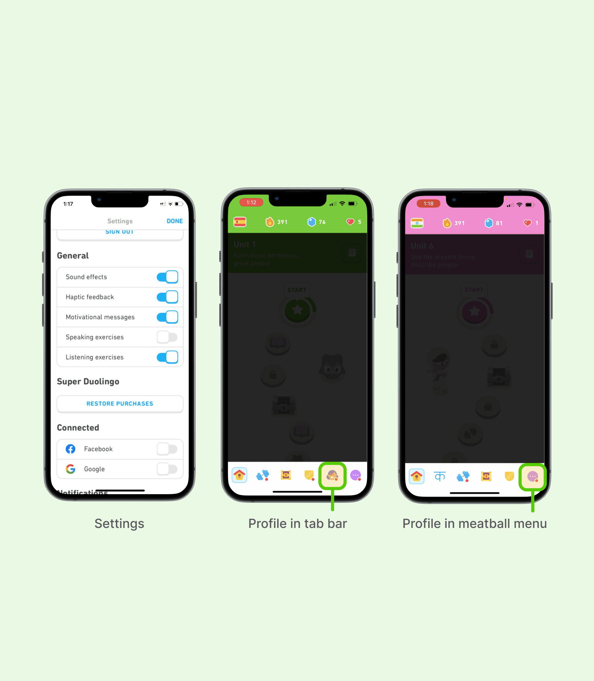
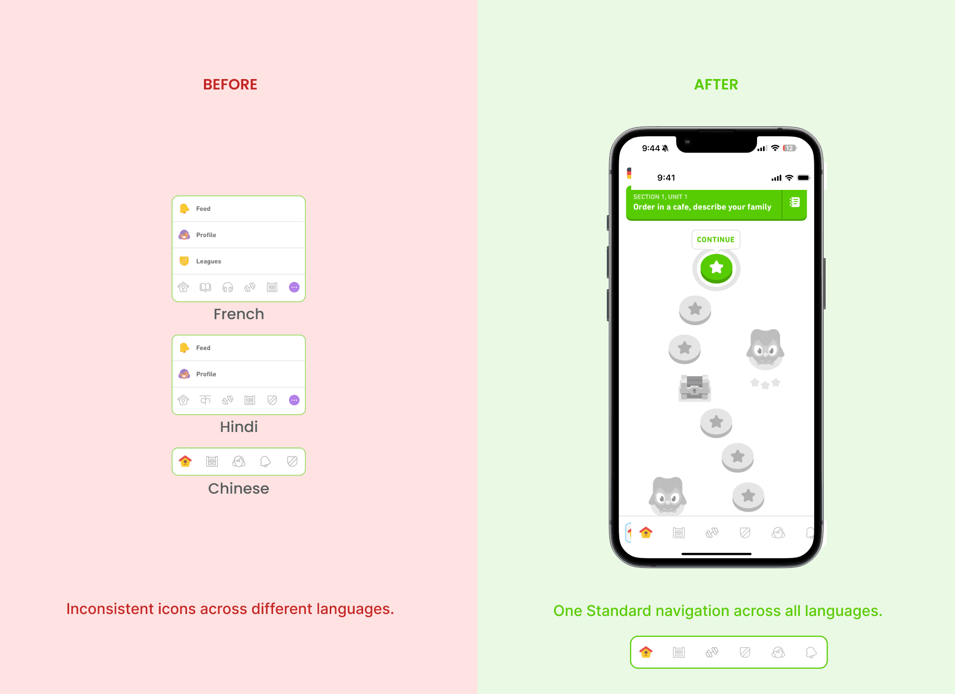
Heuristic 04: Consistency & Standards
Severity - 4
Actual Issue:
The placement of icons is inconsistent from language to language. Only some tap bars have meatball menus. When Duolingo does split testing, the use of icons in the same language could be different for two users. The PROFILE/USER icon resembles a woman and may not seem inclusive to all populations.
Impact:
Users cannot remember the positions of icons, thus having to recall or possibly try and fail every time instead of choosing the correct icon intuitively after several uses.

We then identified competitors in the industry by researching their strategies, strengths, and weakness to get clear overview of their place in the competitive environment.


Through this competitive analysis we got an opportunity to analyze the learning strategies and features offered by competitors, which widened our views on language learning as a whole. It also helped us understand what makes Duolingo one of the most competitive players in the language learning field.
Before conducting our user interviews, we prepared 🔗 recruitment screener, 🔗 moderator script and test packet, and other additional required documents. The purpose of this study was to gather reactions and feedback to the Duolingo mobile application, particularly from users who are using English as a base language to learn other languages. Each session, facilitated by a moderator and notetaker, was screen recorded for meticulous review, and participants were encouraged to voice their thoughts aloud during tasks, contributing to a comprehensive evaluation of the app’s usability.
8
User
1 Wk - 4 Yrs
App Experience
8
Tasks
30-45
Minutes Test
3
Post-Test Questions
10
SUS Questions


At the end of each usability testing session, users was given a 10 standard questionnaire to quantify the user experience of the website.

Information Architecture
Insights
1
The information in the app is currently uncategorized making it difficult for the user to locate the options that they are looking for.
2
The app also contains pages that have redundant information. And similar categories scattered across pages.
Recommendation
1
The information needs to be categorised better so users can search for things more intuitively and thereby optimizing the app’s real estate.
2
Introducing a search option in pages that contain a range of information is useful.
Consistency
Insights
1
The icon placement across different language courses are not consistent which leads the users to assume that different languages may have different options.
2
In some cases, the icons and their functions are not intuitive to users.
Recommendation
1
Using more universal icons or labelling the icons will be helpful to users.
2
Maintaining consistent placement for icons across languages will improve user trust.
Changes


Conclusion
While the System Usability Scale (SUS) scores for Duolingo’s mobile app highlighted good usability, our detailed Usability Test uncovered specific areas for improvement. Issues with information architecture, and icon consistency, suggesting opportunities for refinement. This nuanced analysis emphasizes the ongoing journey to optimize user experience, showcasing the commitment to delivering an even more seamless language-learning platform.

